OrderFresh
A mobile application that helps people to engage and sustain a healthier way of eating.

Timeline
Oct 2016 - Dec 2016

My Role
Designer,
Researcher

Tools
Figma, Adobe XD, Illustrator, inVision

Skills
Research, Storyboard, Sitemap, Prototyping,
Usability Testing
Background
Many people are unable to access sustainable food options because they face time constraints, limited budgets, and inconvenient options. Thus they are unable to consume the healthy products they want and instead opt for harmful alternatives such as fast food or low-quality options.
So, how might we help to improve the quality of the food these people eat?
This case study is a part of the User-Centered Design curriculum at the University of Washington. My design team of four envisioned and designed OrderFresh to help users know about their food, develop a healthy diet and have fresh and local food everyday with greater convenience and affordability.
Design Overview
OrderFresh stands to educate, promote, and provide access for people to take control of their health and well being while supporting sustainable practices and environmental practices.


Login / Register
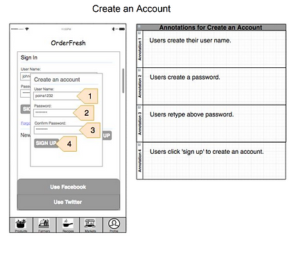
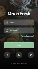
Login to OrderFresh through email or social media accounts. First-time users can register to set up contacts and payment methods.
Users can choose to skip the process and retrieve the setup pages through "profile" page.
Purchase Products
Filter the products by their types (vegetables, fruits, meat...), characteristics (Non GMO, Organic ...), farm distances (more or less local farms) and ratings.
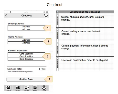
Add the products you like to the cart and proceed to checkout.


Farm Details
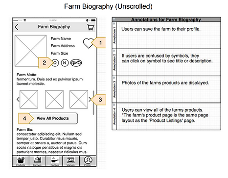
Filter the farms you like and add them to your favorite farms. Learn more about the farm and its produce by reading the farm biography and watching the videos about the farm.
Check out the farm reviews and buy products directly from the farm if you like it!
Find a Recipe
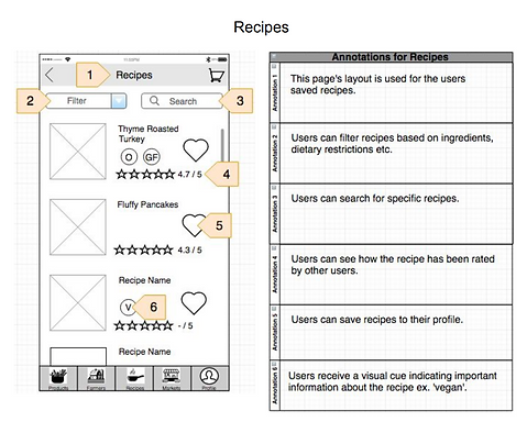
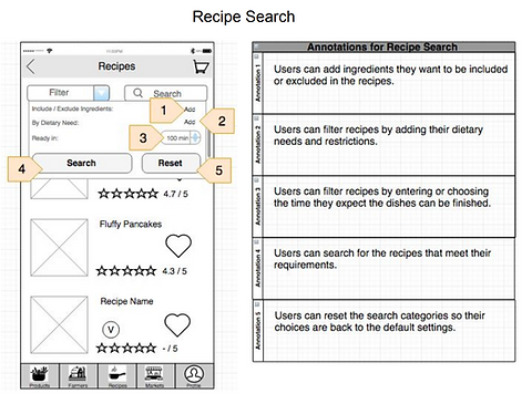
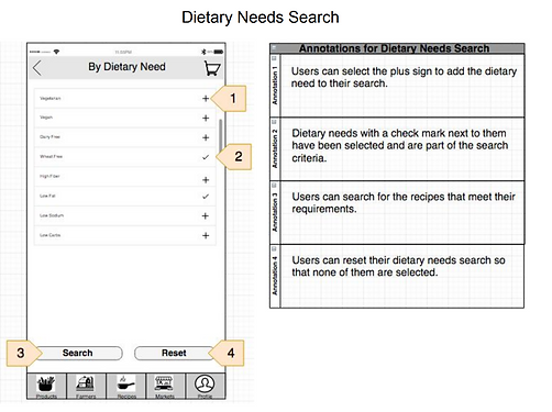
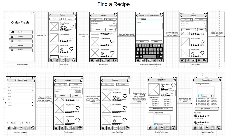
Filter the recipes by cuisine type, dish category (starter, main, dessert...), dietary need, cooking time and ratings. You can also choose the main ingredients you want to include in the recipe.
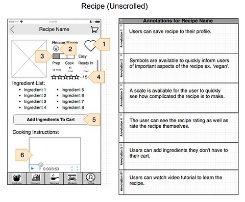
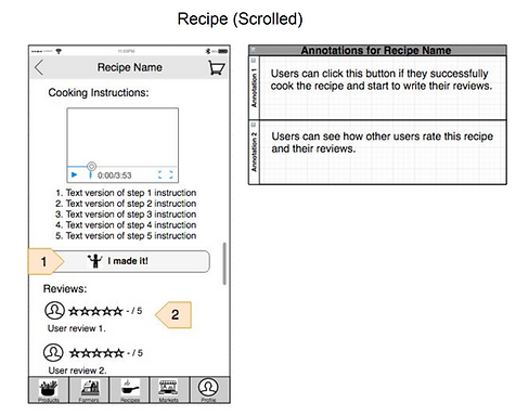
Select the recipe you like and buy the needed ingredients directly from the page! Follow the cooking instructions through watching the videos and/or reading the detailed step-by-step text instructions. Share your success with the community and add your reviews!


Market Ride-share
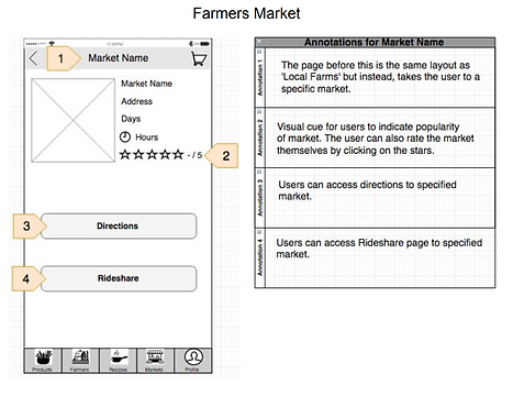
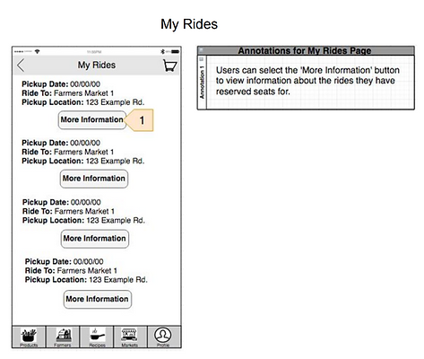
Find other market-goers or Uber groups heading to various farmers markets and reserve your seats. Attend farmers markets without the hassle of a bus or a long walk!
Design Process
We used the Alan Cooper's Goal-Directed Design approach to reach our final product solution for OrderFresh.

Competitive Analysis
I took a careful look at existing solutions within our context and analyzed their strengths and weaknesses in order to determine potential threats posed to our product and identify undeveloped opportunities left available for us to design for.
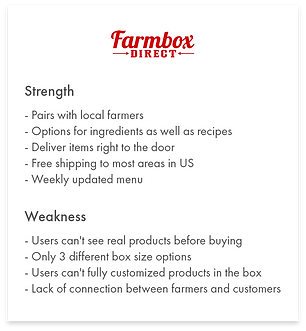
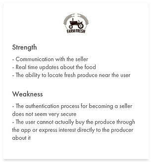

I found there was no service offers customers a full experience from learning about a farm and its owners, to modifying recipes based off of customers' preferred products and farms. Thus, one of the potential opportunities the current market makes available for us is that we can incorporate the ability for our users to find everything they would need in order to enjoy local products and local markets.
User Research
We got three key takeaways from interviewing 10 participants reflected a wide range of ages, career paths, and financial security.
Participants were at least somewhat curious about where their food comes from.
Participants were concerned about their general health and well-being and at least consider organic food.
Frequenting farmers market or higher-end grocery stores like Trader Joe’s and Wholefoods was not a sustainable option for most participants in terms of convenience and affordability.
Personas
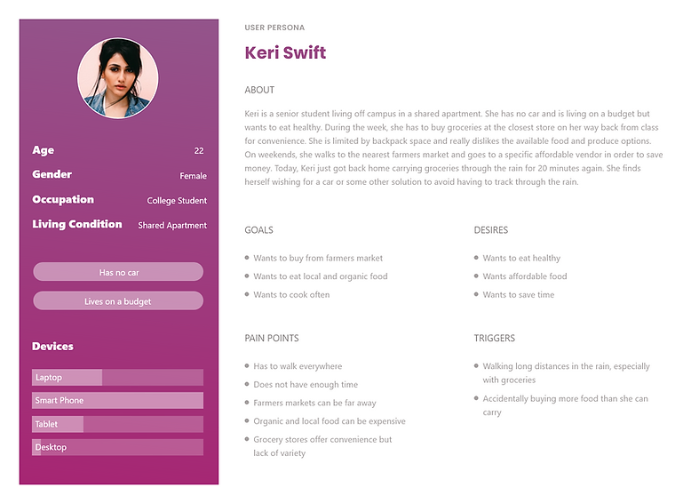
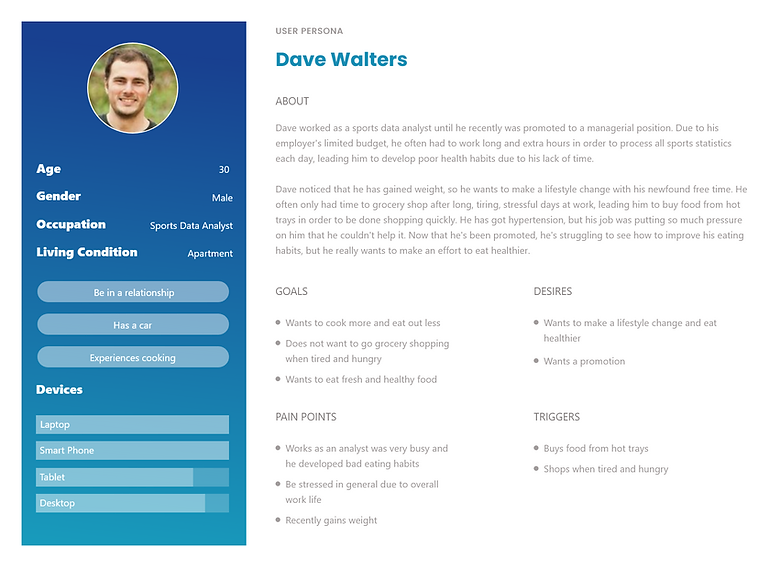
We defined our target user as a health conscious individual who lacks the ability to grow his or her own garden and does not have the time to go to a farmers market or actual farm on a consistent basis. We created three personas based off of our user interviews and online research.

Ideation
I brainstormed and sketched out screens and features of various concepts and components without worrying so much about feasibility just yet.
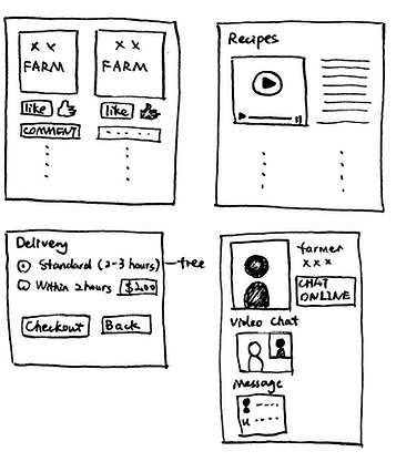
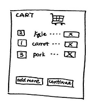

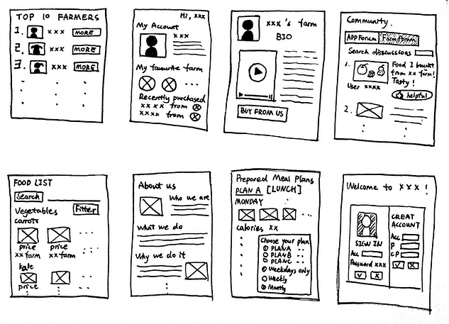
Then my team conducted a group critique. We commented on the strengths, weaknesses, feasibility, and
originality of each sketch.


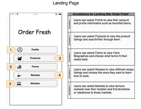
We pooled similar ideas and decided on our three most promising user-interface functions:

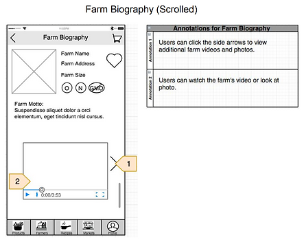
Farmer Bio: Helps consumers know more about the source of the food through allowing farmers to add a personalized description to show off their farm and highlight key information consumers might want to know.

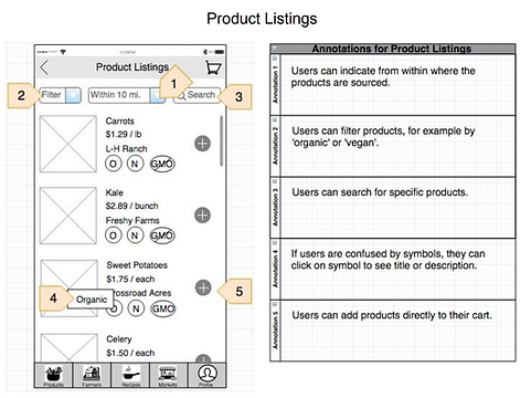
Product Listings: Allows users to filter products by type (fruit, vegetables, meat, dairy), characteristic (organic, natural, GMO-free) and their farm location.
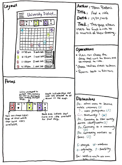
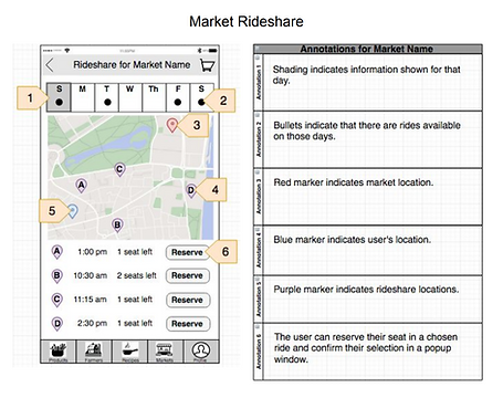
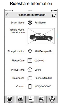
Market Ride-share: Enables users to find other market-goers or Uber groups heading to various farmers markets and reserve a seat, allowing them to attend farmers markets without the hassle of a bus or a long walk.
Storyboard
I visualized how users would actually use OrderFresh by creating both photo and sketch storyboards to understand the context in which our users would engage and interact with the app.
Finding a ride-share:

Food delivery:

Recipe:

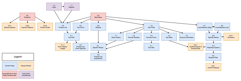
Information Architecture
Paper Prototype
The paper prototype was divided into three main tasks that were later used to evaluate our design through user testing.
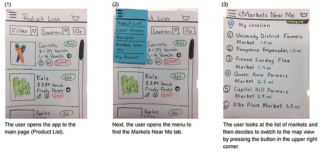
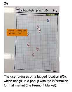
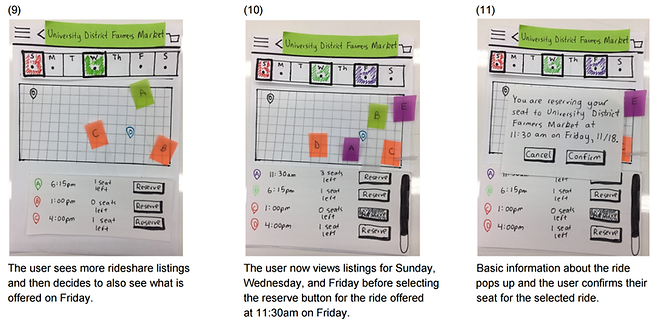
Task 1: Look at markets in both list and map perspectives, view rides on Sunday, Wednesday, and Friday, and then sign up for a ride to University District Market at 11:30am on Friday, 11/18.


Task 2: Locate local farms, find LH Ranch’s farm biography page, watch a video from their farm, and add their farm to your favorites.


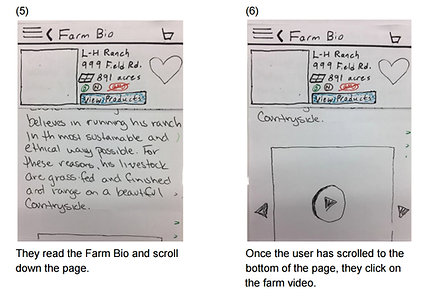

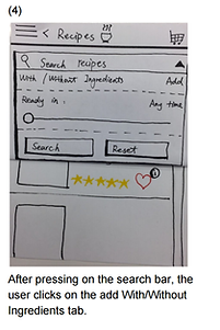
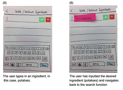
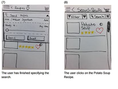
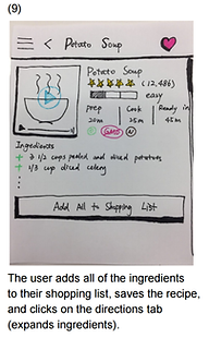
Task 3: Look up a recipe using potatoes, save the potato soup recipe, and add the ingredients for potato soup to your shopping cart.


Usability Testings
We conducted usability testings with 6 participants with our paper prototype and gained five key takeaways from these testings.
Finding: Market Map/List View is Unnecessary
When participants tested the map and list views for finding nearby farmers markets, we realized that the map view is confusing and does not display all the information that is needed for the user to make a decision on where they want to go.
Solution: Combine Map and List View
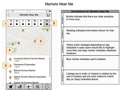
We changed the design to a single combined map-list-view page and placed letter labels on the market location pins for clarity. We redesigned this page in a similar style to the Ride-share page, where users can select for which day of the week they would like to view markets.
Finding: Ride-share Day Displays are Confusing
Ride-share displays are confusing for users attempting to find rides to markets. Participants did not understand the correlation between the days of the week, colors, and location pins on the map. We intended for our display to have a different color for each day of the week that corresponded to the color of a location pin on the map, so that users could distinguish between rides on different days, but this design is clearly ineffective.
Solution: Only Display Rides For One Day
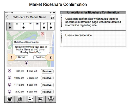
We refined the design of the Ride-share page to only show rides for one day at a time in order to eliminate the confusion regarding the several colors and days and overall help people more quickly find what they are looking for.
Finding: Farm Bio Symbols are Unclear
The Farm Bio page’s symbols for natural, organic, and GMO-free are unclear in meaning. Participants were largely unaware of what “O” and “N” stood for. While some users had difficulty with these symbols, others found it vital to the page.
Solution: Provide Full Name of Symbol When Pressed
We improved by allowing users to tap on the symbol in order to see a small tool-tip appear. For example, the “O” icon shows the text “Organic” when tapped on by users. This feature is also added to the similarly-designed icons on the product listing page.
Finding: Farm Bio Content Could Be Better Prioritized
While most of the participants liked the Farm Bio page overall and especially praised the ability to open a list of that farm’s products, they voiced concerns when it came to page content. Participants expressed their first priority was to find the farm’s products instead of seeing the description of the farm.
Solution: Horizontal Scrollbar With Products
Taking into account these priorities, we added a horizontally-scrolling panel showing the products, as well as a “view all” link to see all of the farm’s products in a standard product list view. We also shortened the farm description to a few lines that could be expanded further if the user was interested in reading more.
Finding: Recipe Search is Complex and Confusing
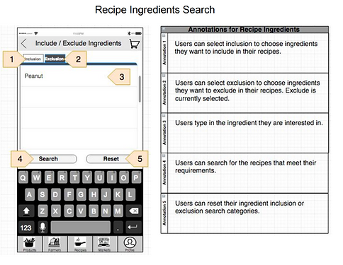
Half of our participants found aspects of the recipe page’s search functionality to be confusing. Participant 4, after typing in the search query, thought that pressing “Done” would initiate the search—she failed to realize that she had to press “Search” afterwards. Participant 6 was unsure about the meaning of the green plus and red minus controls in the search text popup. Participant 5 had issues with the flow of the search interface: he expected pressing search (from the recipes page) to open a simple search functionality, but he was instead surprised when the extensive search popup opened. He further noted that the time slider conveys time less effectively than a drop-down would. Participant 5 also mentioned that he would like the ability to exclude specific ingredients (in addition to the existing “include” functionality) for the sake of avoiding allergens.
Solution: Simplify and Revamp the Recipe Search
We had to revamp the recipe search feature while simplifying it for ease of use. To simplify the recipe search while incorporating advanced functionality, we made the search button open a basic search that allows users to search through recipe titles and ingredients easily. To seamlessly incorporate advanced functionality, we placed an expandable area below the search text field that allows users to include or exclude specific ingredients as well as limit results to recipes cookable in a certain time range.
Wireframes





Interaction Flow

Final Product
Login / Register: Login or Register to setup your OrderFresh account.



Product Listing: Search or filter products you like and add them to cart.
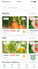

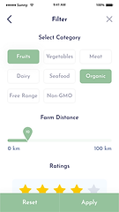


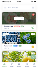

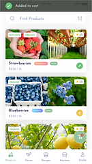

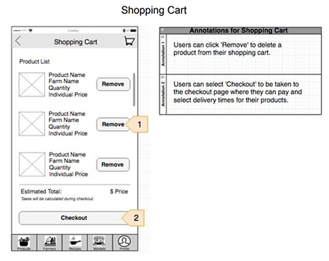
Shopping Cart: Edit your shopping cart and proceed to checkout.


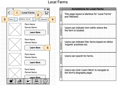
Farm Listing: Search or filter farms you like and buy products directly from your favorite farms.
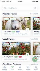

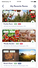

Bookmark the farm you like for easy access.


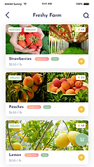

See all products of the farm you selected.
Recipes: Search or filter recipes you like, follow the instructions and prepare your meal.
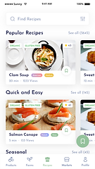


Select ingredients you want to include in the recipe.
Select your expected preparation + cooking time.


Buy ingredients needed for the recipe directly from the page.
Share your success with other users.
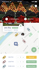
Market Ride-share: Find other market-goers or Uber groups heading to various farmers markets.


Select the market you want to visit.


Confirm your reservation of selected ride-share.

Reflection
A good app is not just a good idea: it takes time, research, critiques, and failure. I believe becoming a designer is no different. It takes time to learn the design process, researching new techniques, receiving critiques on the thought process, and failing from time to time.
It was vital for the project and myself to incorporate a user-centered approach. I received critical iterative feedback from my users, peers, and professor that allowed me to think outside the scope of the original conception.
The project not only helped me better understand the role of a UX designer, but also prepared me for being a solid analytical, creative and visual thinker with good communication and collaboration skills.