VPEsports
A mobile experience design of an e-sports news aggregation application.

Timeline
Jun 2018 - Jul 2018

My Role
Product Designer
UI Designer

Tools
Google Analytics, Lucidchart, Adobe XD
Introduction
VPEsports is dedicated to bring e-sports fanatics the latest news, coverage and schedules from e-sports events and teams worldwide. It has built an elite editorial team, devoting to the global culture of e-sports and gaming. VPEsports grows rapidly through engaging writing, videos, relevant news, in-depth analysis, and more. It was initially built on web, with responsive design on other digital devices.
Since I was asked to help improve VPEsports, I started from researching VPEspots through Google Analytics. Surprisingly, I found 62.29% of our users were accessing the website through mobile devices. As we were using responsive design, we do not have complete control over how the GUI appears on mobile screens. This is particularly problematic for complex designs on VPEsports which might not translate seamlessly across screen sizes. So how might we help our mobile users easily navigate through VPEsports ?

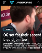
Mobile view of VPEsports is hard to use.
Design Process

Research
Because of the business constraint, I have to squeeze research into limited budgets and short timelines. I started my research from observing data analytics result on Google Analytics and GrowingIO in order to learn about our audience and their behavior on VPEsports website.

Users:
-
18 - 34 years old
-
North American & South East Asian
-
New visitor 39.24%; Returning visitor 60.76%
-
53.4% Traffic from Direct Visit
-
62.29% Mobile Users

Behavior:
-
Users in South East Asia were experiencing an average of 15.20s page load time
-
Most popular game titles: Dota2, CSGO, League of Legends
-
Most popular features: News, Matchticker, Full schedules
Conducting user interviews was still part of my guerrilla research plan. I recruited 2 users through website registered email list and had a 20 minutes short interview session with each of them to understand how, when, where they normally use our website, what contents or features do they read or use, why not others and their struggles and expectations.
From the research, I mainly realized:

Users liked to check e-sports news and events through interstice of time in their daily life.

Users were overwhelmed by excessive news of game titles which they were not following.

Users were tired of checking tournament schedules over and over again for not missing a game.
Persona

Problem Statement
E-sports fans need a simple and convenient way to access the most up-to-date news about their favorite games, teams and players anytime anywhere.
I identified a list of design requirements to address the problem statement. Most notably, the solution needs to:
Provide e-sports fans most up-to-date e-sports news to read based on their preferences.
Help e-sports fans to keep track of their favorite teams and players' tournament schedules.
Allow multi-platform access to VPEsports articles.
Information Architecture
I defined the minimum viable product based on the timeline I had and built this sitemap. Then I held a meeting with the manager and developers to see their thoughts about whether the MVP is feasible or not. This was one of my crucial steps in the process because by communicating with developers at this time of the process, I was able to understand the technical constraints so that I don't waste my time designing something which can't be developed.

I grayed out the parts which we didn't want to cover in this version.
Brainstorming and Sketching

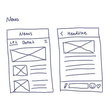
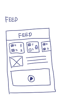
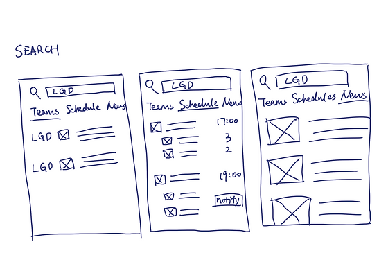
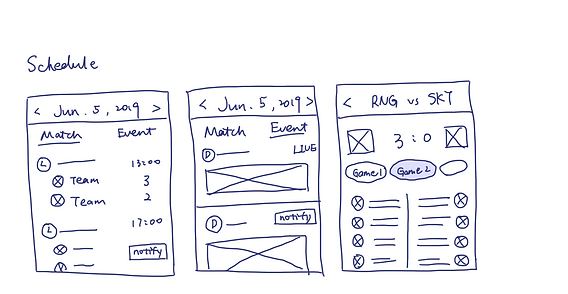

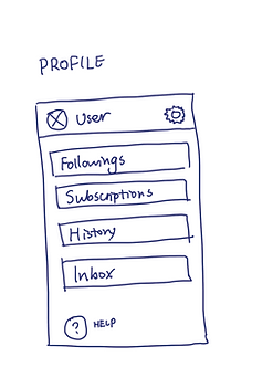
Wireframes
1
Scenario: Go through onboarding (preference setting) and start to browse personalized news.


2
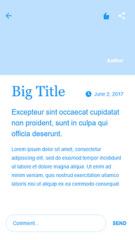
Scenario: Add a new e-sports game title and read an article under it. Comment the article and give it a thumb up.


3
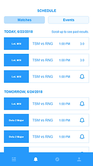
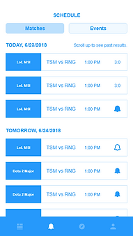
Scenario: Get notified of today's upcoming matches and all matches of the next tournament event.



Usability Testings
Using the interactive wireframes I created to conduct usability testings is one of my guerilla-ising techniques. Also, instead of sending emails to recruit VPEsports users as my testing participants, I recruited participants through social media. But since I don’t want to reduce time and effort so much that I bia my results, I still keep the same overall number of usability testings sessions I planned to run to keep a reasonable sample size.
ISSUE 1:
Users are tired of scrolling a lot to see tournament matches happening on different dates.
SOLUTION:
Referring back to my interview notes, I found participants did mention that they normally checked the tournament schedules of the whole week to reserve time for watching their interested matches. So I made a date selector on top of the schedules and a semi-transparent "back to today" button at the bottom of the page to enable users quickly go through the tournament matches over weeks.


SOLUTION:
ISSUE 2:
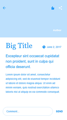
Up-voting and sharing icons on the news article page are hard to notice.
I moved the up-voting and sharing icons to the bottom of the page, right next to the comment box. My decision was made through drawing a simple user flow diagram to show path that users follow when reading a news article. Since commenting, up-voting and sharing are all social features which require user interaction, putting them together can make them more noticeable as a group and easier for users to interact with.


ISSUE 3:
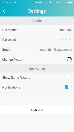
Some users don't want to see spoilers of past games which they plan to watch replay.
SOLUTION:
I added an option of show spoilers to the settings page and default the setting to be "hide spoilers".
1

Final Design


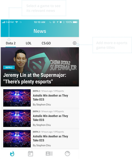


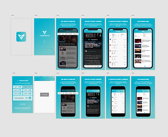
Here's an overview of all user interfaces:
LOG IN / SIGN UP

ONBOARDING
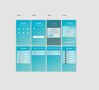
SCHEDULE

PROFILE

MESSAGES AND SETTINGS

LOG IN / SIGN UP EDGE CASES

NEWS

FEED
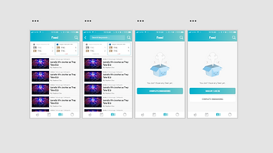
AVATAR
OTHERS
Takeaways & Next Steps
What was the biggest challenge and what did I learn from it?
One of the biggest challenges for me was to conduct research under time and budget constraints. I only have about one month to get all the final user interfaces prepared and hand over them to the developer. My manager asked me to skip the research phase altogether but I know user research is crucial for making sure I'm solving a real user problem. To find a workaround, I learned to do guerrilla research through focusing on pooling the resources I've got and streamlining the process as much as possible.
Another problem I encountered was when I figured out more user needs through doing the usability testings, I can't control my burning desire to solve those newly discovered problems. As a result, I was distracted from my minimum viable product and started to make my design more complicated. I didn't realize the problem until I felt I was going to run out of time. To prevent myself from being distracted, I wrote my problem statement on a sticky note and stuck it on the wall above my desk so that I could refer back to it whenever I needed to regain focus.
What is the next steps of this project?
This version of VPEsports app was the first released version of our minimum viable product. There are additional features which I held back to future releases on the information architecture diagram. For next step, we will focus on the remaining parts of the IA and start from creating lo-fi prototypes for those features. I also documented newly discovered issues from usability testing sessions and I plan to address those problem in our 3rd iteration.
